Ever walk into a business and immediately feel something… but you’re not sure why?
It’s not the lighting.
It’s not the music.
It’s not even the smell of fresh coffee.
Most of the time, it’s color.
Here on Long Island, especially across Suffolk County and neighboring Nassau County, business owners spend serious money on signage, branding, furniture, and digital marketing. But the wall color? That sometimes becomes an afterthought. And the funny thing is, those walls are doing more emotional heavy lifting than people realize.
Secondary colors, when used thoughtfully, can absolutely influence how customers feel inside your space.
And that matters.
What Are Secondary Colors, Really?
Quick refresher. Secondary colors are created by mixing primary ones:
- Red + Blue = Purple
- Blue + Yellow = Green
- Red + Yellow = Orange
Then there are neutrals like gray and brown, which technically aren’t classic “secondary,” but they behave like emotional middle ground colors in commercial interior design.
Commercial interior painters in Suffolk County NY see this play out constantly. A slight shift in tone can change how a retail space feels on a rainy March afternoon versus a bright August day near the South Shore.
And if you’ve lived here long enough, you know our light changes a lot.
Gray: Safe… But Only If It’s Done Right
Gray gets a bad reputation. People call it boring. Corporate. Cold.
Sometimes that’s fair.
But here’s what we’ve noticed. The right gray in a Suffolk County office can feel modern and steady, especially during winter when skies go flat and everything outside feels muted.
The key is variation. Commercial painting contractors rarely use a flat, one-note gray. Subtle undertones matter. Warm grays feel grounded. Cool grays feel clean and sharp. Mix in texture, natural light, maybe wood accents, and suddenly gray feels intentional instead of lazy.
Mistake to avoid? Picking a gray under showroom lighting and never testing it under real daylight. Long Island sunlight in July is very different from January.
Brown: Stability Without the “Heavy” Feeling
Brown often shows up in professional offices, medical facilities, and financial institutions. It communicates reliability. Structure. Steady footing.
But too much dark brown in a smaller Suffolk County retail space can feel cramped. Especially in older buildings with lower ceilings.
If you’re operating near Huntington, Patchogue, or Smithtown in a converted storefront, lighter browns or warm taupes usually perform better. They feel grounded without pulling the ceiling down on you.
Commercial painters working across Nassau and Suffolk County often blend brown with subtle green undertones to keep the space feeling natural instead of dated.
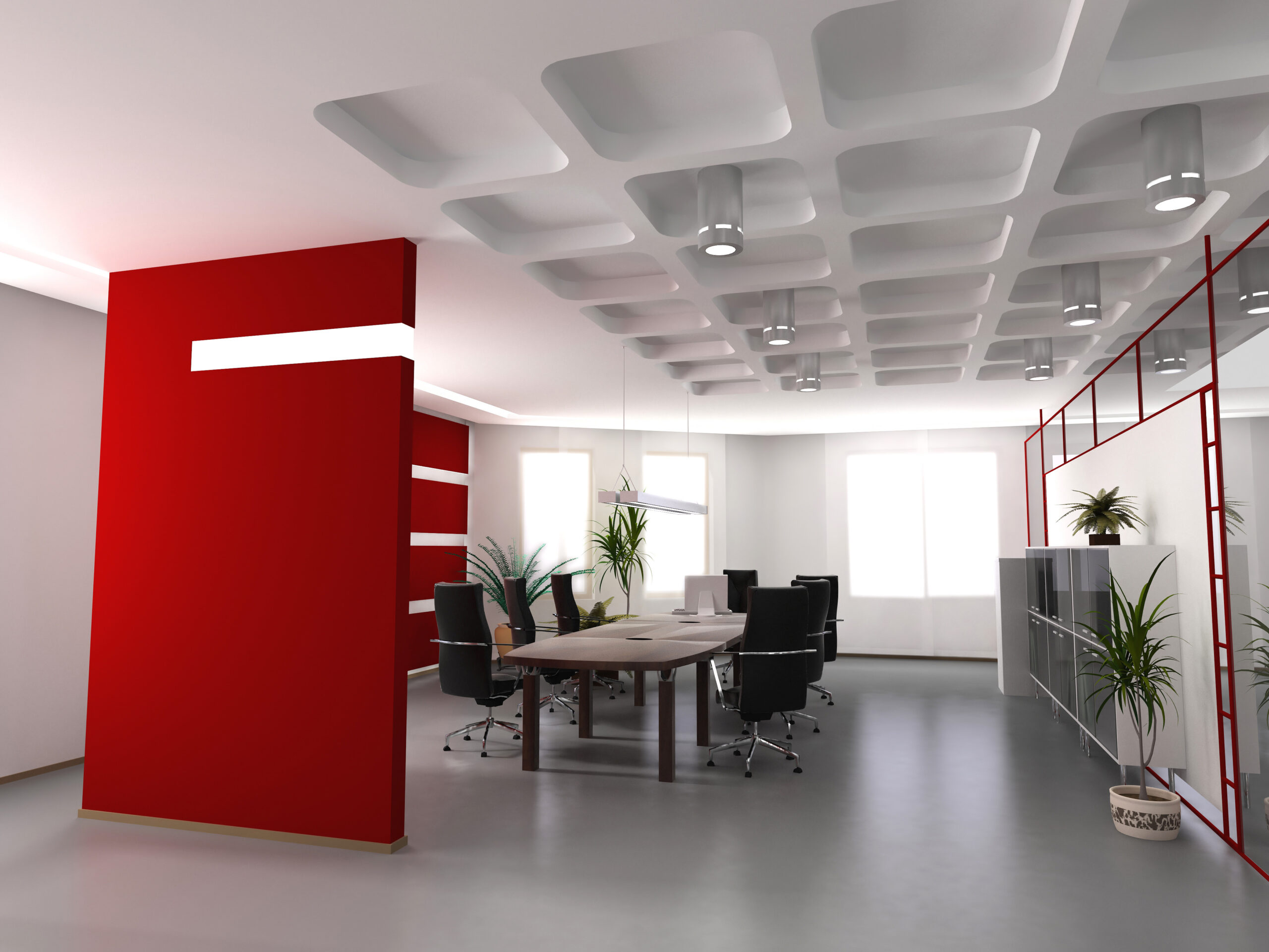
Purple: Luxury, But Use It Carefully
Purple can signal exclusivity. Higher-end retail. Beauty services. Boutique environments.
But full purple walls? That’s bold.
Accent walls or branding zones tend to work better. We’ve seen small retail stores near busy shopping corridors use deep plum behind the checkout counter, while keeping the rest of the space neutral. It gives personality without overwhelming customers.
And yes, purple can skew differently under Long Island’s coastal humidity and sunlight. Testing is smart.
Orange: Energy Without the Aggression
Orange brings movement into a space. Restaurants, fitness studios, youth-focused retail spaces often use it for that reason.
But here’s the catch. Orange can age quickly if it’s too trendy. And in Suffolk County’s competitive commercial landscape, you probably don’t want your space looking like a design experiment from five years ago.
Commercial interior painters often recommend softer, muted oranges or terracotta-inspired tones that feel warm instead of loud. Especially helpful during colder months when foot traffic dips and businesses want interiors that feel inviting.
Green: Calm, Natural, Easy on the Eyes
Green works beautifully in Long Island commercial spaces. It balances energy and calm. And in areas surrounded by water and trees, it just feels right.
Healthcare offices, wellness centers, and even corporate offices use green to create ease without dullness.
If you’re curious about local economic development or business planning resources, the Suffolk County official site has helpful information:
https://www.suffolkcountyny.gov
Weather and Light Matter More Than You Think
Suffolk County deals with:
- Humid summers
- Nor’easters
- Long gray winters
- Strong coastal sun
Color shifts with light and season. A shade that feels warm in October might feel washed out in July.
Commercial painting contractors factor that in. Especially for businesses near the water where reflective light bounces differently off interior surfaces.
Budget and Longevity
Here’s something business owners sometimes overlook. Rich secondary colors can require better primers and higher-quality coatings to maintain vibrancy.
Cut corners on materials and those deep greens or purples can fade unevenly, especially near front windows.
It doesn’t mean secondary colors are expensive. It just means material quality matters.
Common Mistakes We See
- Choosing trendy colors without thinking about brand identity
- Ignoring lighting
- Painting too many bold walls at once
- Skipping prep work
Prep is huge. Even the best color fails on poorly prepared drywall.
So, Can Secondary Colors Help?
Yes. If they align with your brand and space.
They can make customers linger longer.
They can support your brand personality.
They can make your space feel intentional instead of accidental.
If you’re in Suffolk County NY and thinking about updating your commercial interior, Excel Painting works with business owners who want practical guidance, not over-the-top design lectures.
If you’re kicking around ideas or just curious what your current color might be saying about your space, it’s worth having a conversation. Sometimes a subtle shift is all it takes.
Recent Comments